Common Screenplay Formatting Mistakes Readers Notice Immediately (And How to Fix Them)

Here’s the reality in the entertainment industry: the competition is fierce. For an emerging writer, you’re competing with experienced professionals which means you need to make sure that everything you submit is as clean and competitive as it can be. The truth is that most script readers form an impression within the first few pages. Something like a formatting mistake immediately signals inexperience and can distract from your story.
Formatting is not just cosmetic; it affects pacing, readability, and professionalism. It exists for a reason, to succinctly paint a picture of how a scene will appear onscreen. The use of screenwriting software makes the task of writing a screenplay much easier, but there are still some common mistakes to look out for including missed capitalization, too many parentheticals, clunky action blocks, and incorrect transitions.
Let’s identify exactly what those are and how to fix them.
1. Missed Capitalization
The standard rule is that the first appearance of a character should display their name in ALL CAPS. Take a look at the following examples:
CORRECT:
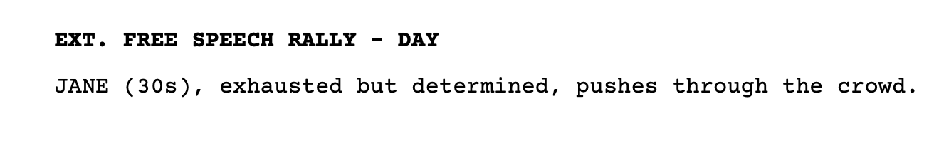
Here we meet Jane and learn a little bit about her, including her age (30s), her state of mind (exhausted), and her persona (determined). With her name in uppercase, we are quickly reminded that this is the first time meeting Jane. During a first reading when the characters are all unknown and there likely isn’t a face to the name, this helps a reader retain knowledge about that character.
Now compare it to the following INCORRECT example:
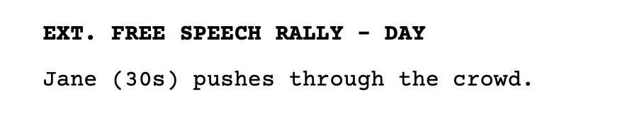
There is nothing memorable or informative about this introduction. Not only does this mean that the Casting Department will have to work harder to glean information about this character in order to know which actors to invite to audition, but readers will be less likely to remember who this person is and why they are important to the story.
Introducing a character with their name in ALL CAPS is an industry formatting expectation and, as a bonus, the way you succinctly describe them will go a long way to demonstrate your skill and voice as a screenwriter. Jane is “exhausted but determined” as opposed to something cliche like “beautiful but doesn’t know it.” It makes her compelling as a character and memorable to a reader who is digesting a lot of new information.
There are other items that are often depicted in all caps, but which aren’t necessarily standardized across the industry. For these, you should remain consistent throughout your own screenplay. This could include sound effects or important props.
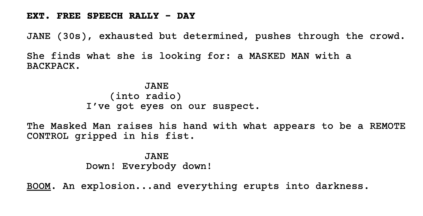
The BACKPACK and REMOTE CONTROL are seen here in all caps, indicating to the prop department and the reader their importance. The word BOOM is both uppercase and underlined, a significant sound effect indeed.
Sound or visual effects might also be bold or italicized, the most important thing is to be consistent in your own screenplay. If you’ve got BOOM on page two and CRASH on page three, the disparity can draw the reader out of the story.
Some tips for catching these kinds of formatting errors are to do a quick word search for each character name and check how you’ve introduced them. For sound and visual effects, take note of your first one and visually scan your document during proofreading to ensure consistency.
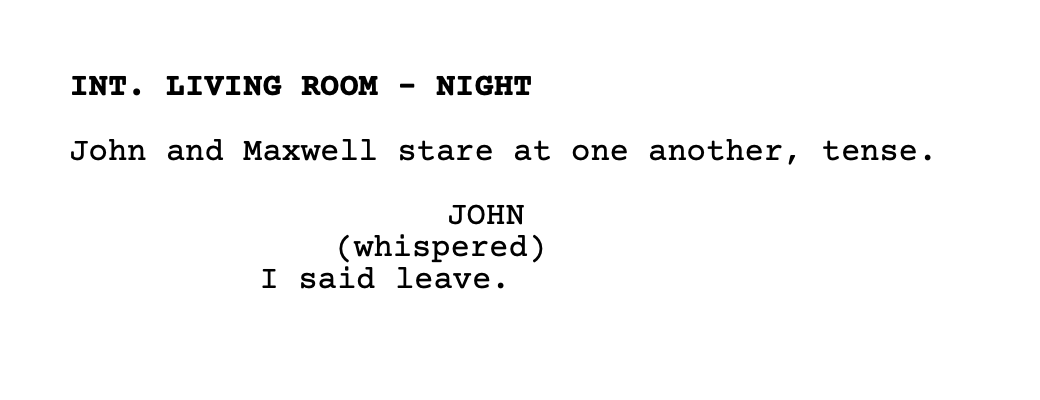
2. Too Many Parentheticals
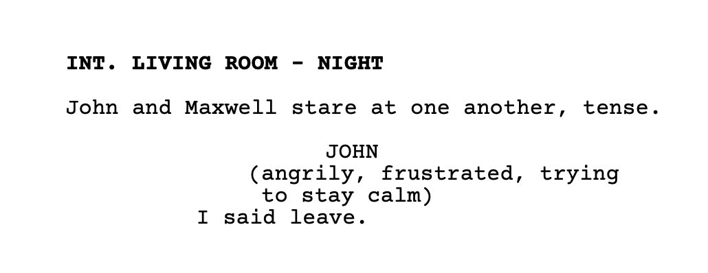
A parenthetical is a small direction note placed under a character name in dialogue. Let’s take a look at an example.
This example shows a clunky, distracting parenthetical. It depicts the common mistake of over-directing actors or explaining emotion excessively. It is a red flag that signals inexperienced writing.
Here’s how it can be more clean:
Determine if the parenthetical is appropriate based on whether the line reading might change the meaning, for example: (sarcastic), or if it can quickly give some action direction or clarity, such as in the example below:
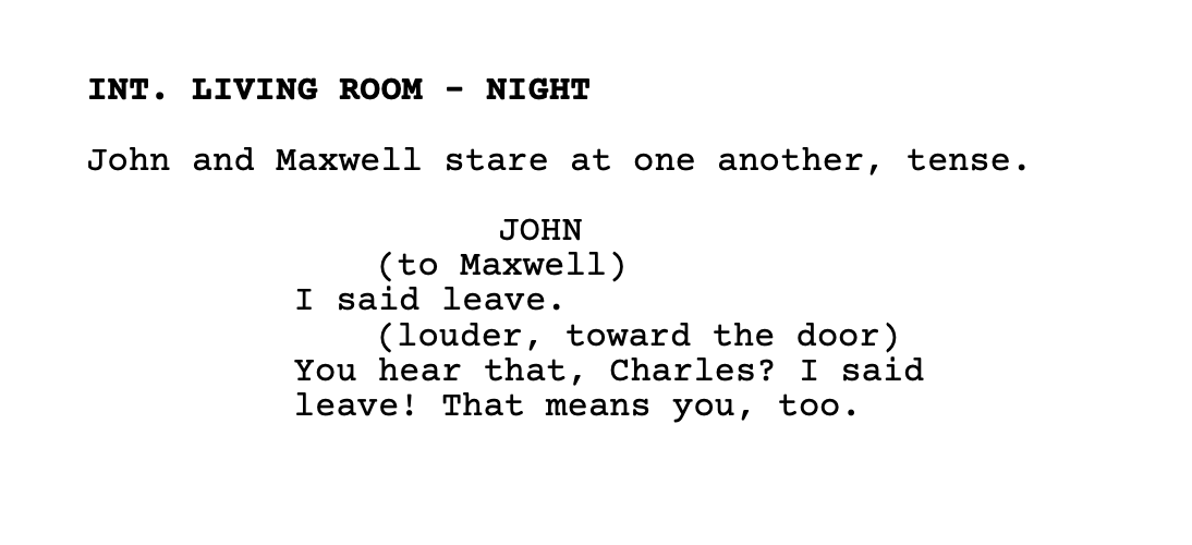
Be frugal with your parentheticals. Too many and you interrupt dialogue rhythm.
Remember to also be consistent with their formatting (I tend to prefer all lower case with no punctuation, but this is another grey area that comes down to user preference).
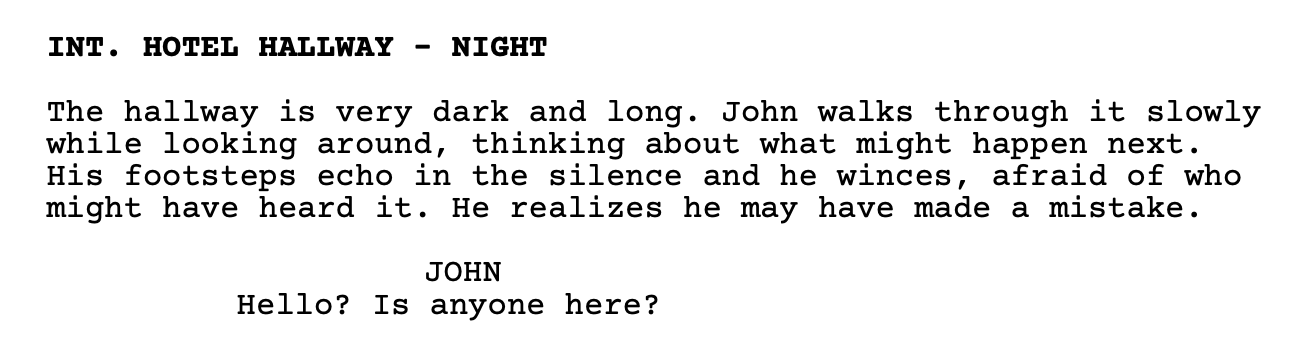
3. Clunky Action Blocks
A screenplay must be visually clean and readable. Great action lines are concise with a peppering of your own voice here and there. A big common mistake is including action lines that are long paragraphs which read like prose.
Consider the following example:
A loose guideline is to keep your action lines to three lines or fewer and to depict only what can be seen onscreen. An actor can’t portray what their character is thinking, but they can play emotions.
Here’s an improved version:
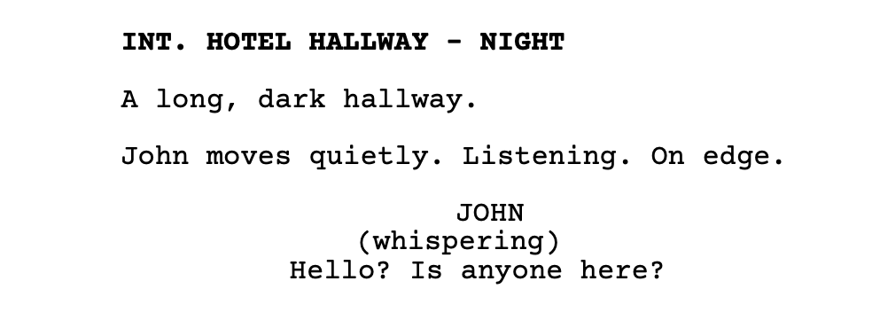
The industry preference is to see white on the page, that negative space behind the text. If it looks like the paragraph of a novel, break it up. A screenplay is visual writing, keep it clean and keep it moving.
4. Incorrect Transitions
Beginners overuse transitions like “CUT TO:” or “FADE TO:” or “DISSOLVE TO:” - the truth is, these are usually unnecessary. The next slugline implies the cut. Here’s an example of an unnecessary transition:
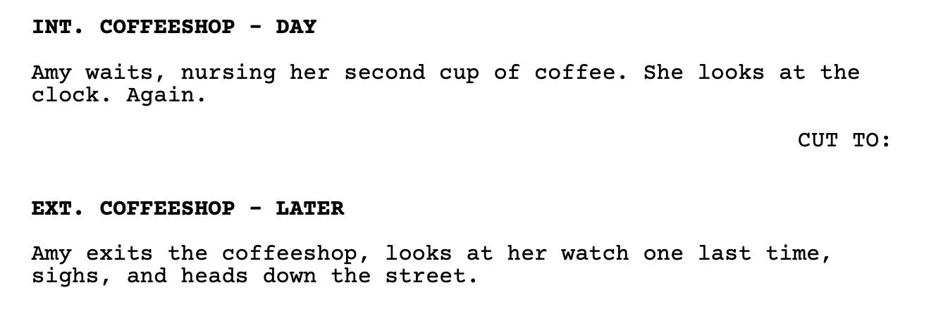
We didn’t need the transition to get to that next moment in time. The truth is, most writers use transitions sparingly. They’re more helpful if there is a dramatic time jump or specific visual effect like a match cut to connect two scenes with visually rhyming elements or maybe a smash cut to indicate something jarring or to emphasize stark contrast.
No matter what, scene transitions should be used strategically to help the flow of the script, overuse will interrupt that flow.
Conclusion
Before submitting any screenplay, run a quick checklist through each of these elements:
First character appearances capitalized - accomplish this with a word search for your character names
Minimal parentheticals - accomplish this with a text search for the parentheses
Action lines under three lines - do a visual scan of your entire screenplay (this is also a great time to check for “orphans” also known as the single word at the end of an action line sentence.
Transitions used only when necessary - do another visual scan or do a text search for the colon
Be sure to especially ensure that your first page, your first three pages, and your first ten pages are free from errors and tell a gripping story. Readers form early impressions and could even stop reading entirely if they are turned off by amateur mistakes.
Formatting is the one of the fastest ways to demonstrate professionalism. It is the absolute bare minimum you must begin with. Poor formatting will erode the trust your reader will feel for your writing ability. Readers notice formatting mistakes instantly because they disrupt the reading experience. The good news: these issues are easy to fix once writers know what to look for. Add a formatting pass to your revision routine before submitting scripts to competitions, producers, or development teams.
Good luck and happy writing!